In this tutorial, I will show you 5 great ways to really make your pixels pop in layout and interface design using Photoshop. These essential techniques will really give your designs a more 3D, tangible feel to them!
I refer to these techniques as “Pixel-Poppers” because they tend to use very few extra pixels (than you would ordinarily use in a design) to make your graphics pop out a bit more. As cliche as it may sound, these different effects really do work, and many modern websites and designs use them regularly.
Let’s take a look at a few:
- The 2 Pixel Divide
- The Pixel Shadow
- The Pixel Bevel
- The Shadow Highlight
- The Vista Effect
The 2 Pixel Divide
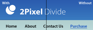
The two pixel divide is a widely used effect on interface design, and layout design. Some quick examples would be Windows Media Player (Version 11), Pixel2Life.com, and 2Advanced.net. It’s a very subtle effect (as most effects should be), so you might not knowingly take note of it. However, the results from it are usually great when used responsibly.
It’s very easy to accomplish, and only takes Two Pixels to really make it.
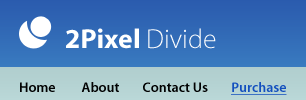
Start out with a simple design, such as a header for a website, with a navigation bar underneath:
Now, Zoom In (Ctrl + “+”) to a close level where you can really start to work with single pixels. Select your Pencil Tool from the tool bar, and select a Foreground Color of White. In a New Layer, draw a horizontal line dividing the banner from the menu (Hold Shift to draw perfect lines).
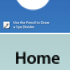
Create another new layer, and using a Foreground Color of Black, repeat this process directly above the white divider.
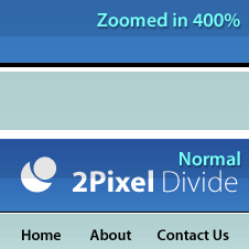
That’s it! After this, I usually lower the opacity on both of these new layers until I find desirable results that don’t conflict with the surrounding elements too much.
The Pixel Shadow
I like to use this effect when I’m working with text or simple designs on top of soft backgrounds. Again, it’s nothing extravagant, but it gives me that extra flare I’m looking for sometimes.
Let’s say I’m working with the document shown below. Adding an ordinary Drop Shadow is going to give the shape and text a very soft shadow, which is not what I’m looking for. However, I do want it to pop out a bit more.
What I do instead is add a Very Hard Drop Shadow.
I’m going to go into the layers blending options (Right click the layer, “Blending Options”). From here I’m going to Add a Drop Shadow, and then set it up so that the Sizeis set to “0″, and the Distance is set to”1px”. Click Ok to apply blending options.
Much Better!
The Pixel Bevel
It’s usually safe to stray away from using the Bevel Blending option in modern layout design, but if used carefully, it can actually be used for good. Take the document below for example.
The orange box has a soft gradient, and even a drop shadow applied to it to give it a little more “Pop”, but it still seems a bit bland.
To fix this, I’m going to go into the Blending Options for the Orange Box Layer, and Add a slight “Bevel and Emboss”.
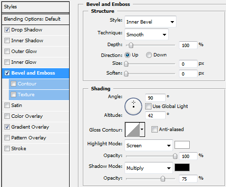
As you can see in the options, I’ve set the size to “0px”, and have adjusted the angle to 90* (to give the effect of a light source from above).

The Result is a box with a lot more depth in it’s appearance!
The Shadow Highlight
Here is another technique that might slip past you on first glance, but makes all the difference in a good design. It’s similar to the 2px divide in that it’s a very subtle, but also effective technique.
Not to mention it’s just as simple.
Take this document for example:
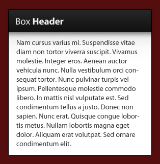
As you can see directly underneath the “Box Header” Black box, I have a slight Drop Shadow. It doesn’t give us a whole lot of “Pop”, but it’s a start.
We’re going to do the same thing that we did for the 2 Pixel Divide essentially.
Zoom In to about 400%-800%, and using the Pencil Tool (White Foreground) on a New Layer, draw a horizontal line at the very top of the Drop Shadow.
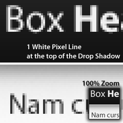
Now just adjust the opacity of this line to blend nicely with the rest of the design. You should end up with a nice separator between the header and the content area (where the shadow begins).

The Vista Effect
I’ve gone into great detail for this effect in my “Vista Window Effect Tutorial“, but I thought that it was nice enough of an effect to at least mention here.
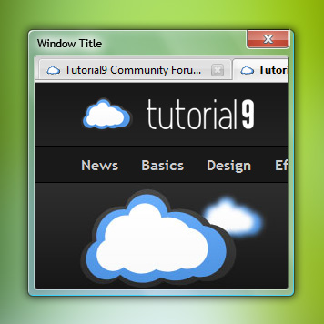
The effect used in Windows Vista’s Aero Theme (for their “Windows” more specifically), uses a combination of different blending options, including “Bevel and Emboss“, “Outer Glow“, “Drop Shadow”, “Inner Glow“, and even “Color Overlay“.
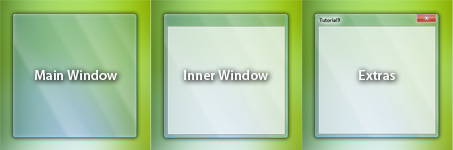
Furthermore, the effect is really set up into 3 parts. You have the Main Window, the Inner Window, and the Extra Parts (The Exit symbol and Window Title).
So, What Makes your Pixels “Pop”?
Hopefully this tutorial demonstrated that you don’t really need some advanced effect to make your designs stand out. Sometimes, 1 pixel can make all the difference in a layouts success. Every Pixel Counts!
Keep your designs simple, and use effects responsibly!
0 comments:
Post a Comment